


Plain Jane, Reclaimed: E-Commerce Imagery as an Art Form
A conversation on commercial image-making and personal image-feeling

Because my 9–5 has been in-house for the last six-ish years, both as a photographer and a retoucher, I spend most of my waking hours surrounded by images. I’m currently the Lead Retoucher at a local photo production house where we create high-volume B2B and PDP assets for major outdoor industry brands. If you’ve ever shopped online and clicked through a product’s images—that’s PDP imagery.1 Buyers for retail see B2B versions. Both categories exist to sell products online.
I’ve spent years creating these types of visuals, but I’ve also been quietly working to reclaim the artistry within them.
For better or worse, I’m often daydream-brainstorming about what can be made within the tight parameters I’ve often encountered in day jobs. How much meaning can I infuse into the seemingly ordinary? Brands always have specific needs as they build their visual identity. How can I push creativity in lighting and posing direction? Where can I move a brand’s visual language forward while maintaining recognition and cohesion with their historical assets—while still feeling like them? How much meaning can I infuse into the seemingly ordinary? There’s a lot to wrestle with in e-comm imagery.


What is PDP Imagery, Really?
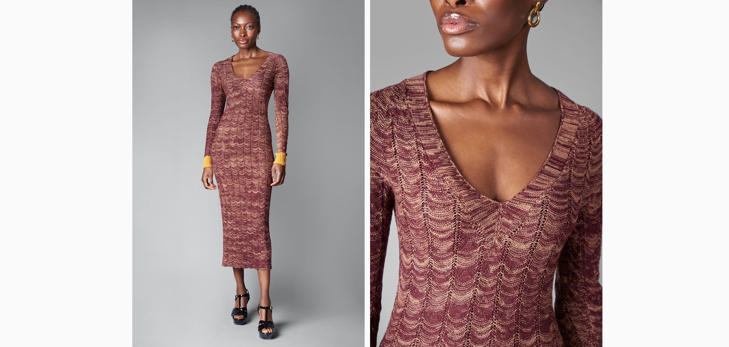
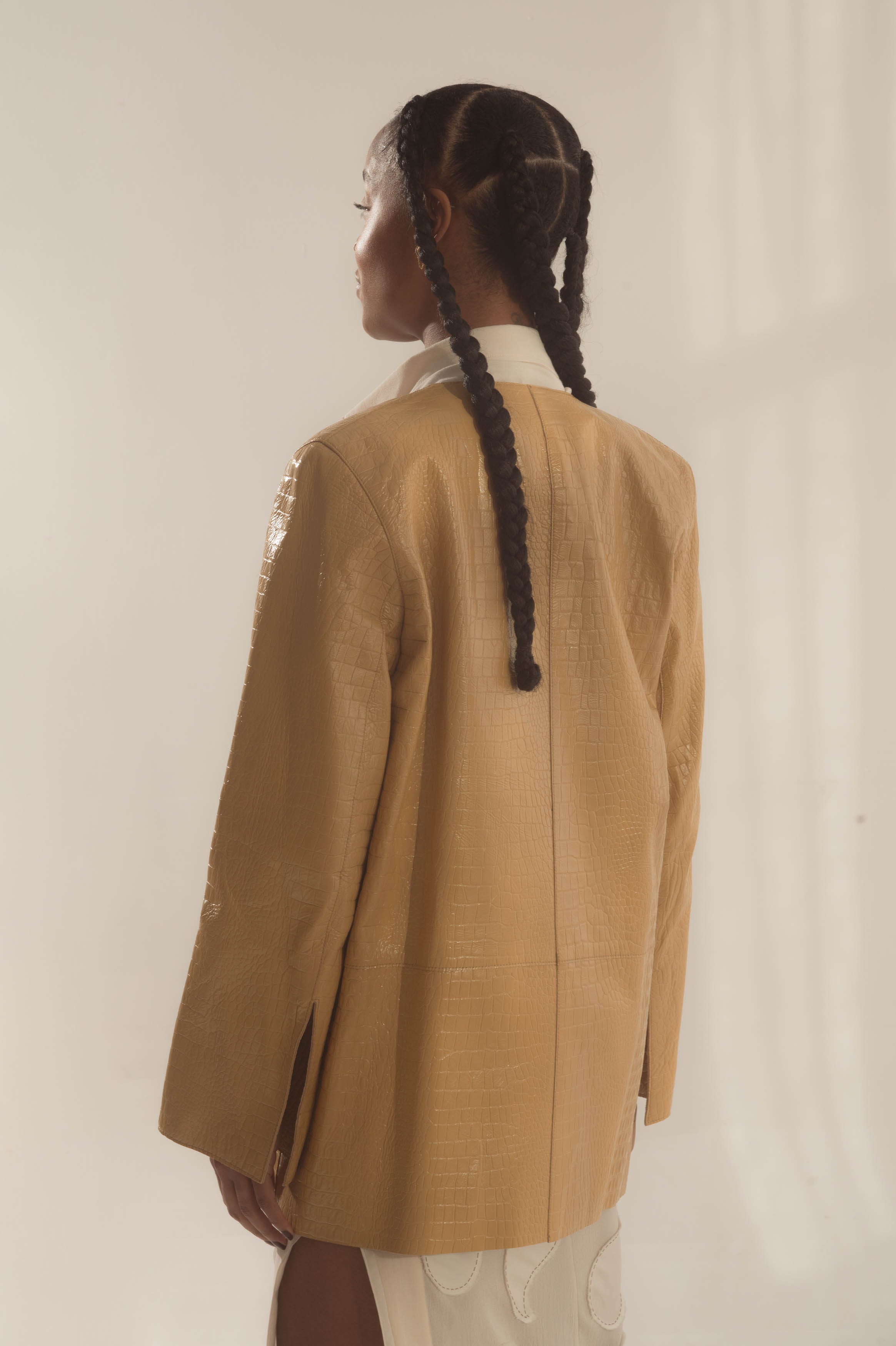
Traditionally, PDP images are simple: a front and back view of a product on a white cyc or grey, but always with a plain background, sometimes with extra detail shots or a video.2 Sometimes modeled, sometimes a flat-lay. The images communicate what makes the item the item: the materials, its construction, the fit.
PDP images provide context in a critical touchpoint in a buyer’s online commerce journey. The best of them blend clarity with persuasion, familiarity with aspiration. The worst of them result in a buyer’s returned good.
E-commerce imagery’s role is to communicate not just what a product is, but why it matters—and why you should buy it. That’s where PDP imagery differs immensely from brand or campaign work—it’s more like an à la carte meal, where each item stands on its own, functional and precise. In contrast, brand imagery is the full-course dinner: curated, cohesive, and made to immerse you in a story.
There’s an industry joke and visible shoulder-slump when it comes to e-commerce work because of its monotonous, repetitive nature and specific standards, but I think there's room for necessary creativity and brand storytelling, even within tight constraints. I’d argue PDP imagery holds a lot of power by nature: Every customer will see a PDP image when purchasing. Not every customer will see the campaign.
Creativity Within Constraints
Most brands offer strict creative parameters: specific HEX codes for background colors, do’s and don’ts for poses and styling, lighting diagrams, margin rules for subject placement in the final assets. The art direction is the skeleton that provides structure for high-volume image production; it ensure visual consistency, efficiency in execution, and cohesion across platforms.
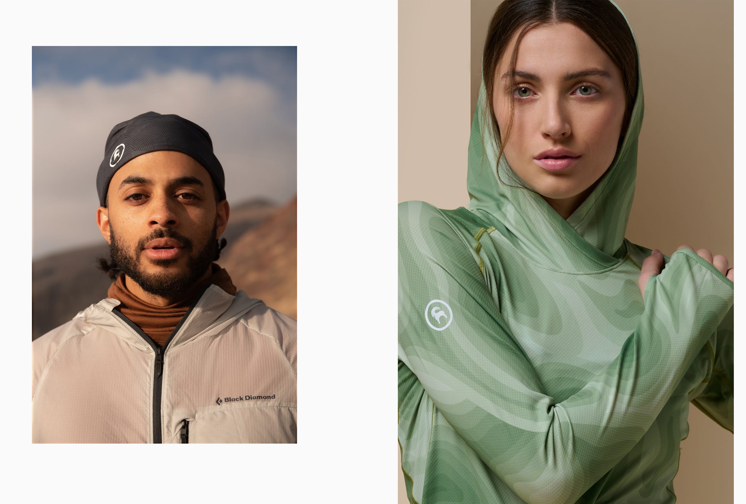
Free People, for example, shifts background colors and lighting direction seasonally, sometimes for the season or per collection—intentional decisions that keep their visual world fresh. From blue, pink or ruby backgrounds and sharp light to a dreamy, natural-light feel on a tan cyc, Free People’s PDP images speak to their brand’s product, vibe and ethos: “all in the name of Creative Spirit.”3
KREWE Eyewear, on the other hand, stays consistent with a light, warm-grey backdrop and soft, sun-kissed lighting. They’ve made subtle changes to their PDP images since I worked there in 2019, but the consistent decision to maintain a relatively similar visual voice over these years PDP decisions echo KREWE’s ethos “we lead with design and let culture drive the rest:” their eyewear gets to speak for themselves.4
Different approaches, same theme: visual intention.


From Experience
As Lead Photographer at Artifact Uprising, my focus was communicating the tactile quality of high-end, photo-forward products for all image needs, campaign or PDP, creating assets for all marketing channels: ads, web banners, emails, etc. As an e-commerce brand built on translating the digital into the physical, AU needed PDP imagery that made customers feel the materiality of what they were buying—with their eyes. Unless you know someone with an AU product, you have to trust the imagery.
But Artifact’s product is not just a monetary investment, it’s a big time-spend to find, organize and design a photo book. So while their AU’s imagery had the expected e-commerce goal of selling the product, it also carries extra responsibility: not only was the goal to make consumers want to touch what they saw—a thoughtfully-designed, beautifully-made vessel—but to commit the energy to honor their memories as printed photographs.


At Backcountry as their Sr. Studio Photographer for campaign and marketing needs, I collaborated with the art director to establish a new light direction for the brand’s PDP model imagery. The brief was clear: develop a repeatable setup that created dynamic dimension without losing e-comm clarity.
I can’t lie—at the time, Rembrandt light and anything adjacent… that sh*t had me in a chokehold. I couldn’t be stopped with that tried-and-true, 45 degree, one-light setup. I love love love seeing the light-triangle appear. I love me a loop. And it was comfortable5, having come from Artifact where I had two strobes and used one the majority of the time. But at Backcountry, I had access to more photo equipment than ever before: the studio was equipped with about ten Profotos and any kind of modifier I could dream of, all the c-stands to rig, and even more sandbags to secure it all—and it was fucking intimidating.
The access at Backcountry opened the door to using multiple strobes in my work, eventually landing on a 3-strobe system for the PDP project: one large and one small octabox stacked vertically and semi-diffused at the model’s right, feathered across the model’s body. This created a gentle punch of light that still softly wrapped the model until it fell to shadow at the model’s left. I added a V-flat for some lift in that shadow, and a skinny modifier pointing at the backdrop from above to eliminate any vignette.
The resulting setup allowed every image captured to be as near website-ready as possible, establishing shape, color and contrast, before any retouching was even performed: all colors were accurate to reality, and the background was near perfectly the target HEX, every time. Simple for repetition between a team of photographers, and still flexible for freedom in storytelling—to allow for movement in posing, to highlight the quality of technical fabrication. To focus on what matters most: the story of the product.


My experience taught me in-situ technical rigor of lighting: how to shape with precision, how to balance multiple modifiers, how to communicate my light design to a team of photographers who would actually execute. It taught me how to better direct models. I was (lovingly) pushed to level up—and I’m grateful. Although my key role at Backcountry was creating all marketing and campaign imagery, not actually executing PDP capture unless needed, I was reacquainted with the familiar, fast-paced photoshoots that e-commerce productions often are, reminding me of my start at KREWE.


Where the Work and the Art Intersect
As I’ve worked with brands over the years, I’ve sometimes felt like a servant-robot to marketing strategy, to corporate job descriptions and a whole lot of burnout. The last year and a half has been about reclaiming creativity. I’m reconnecting with making images on my own terms while carrying the technical discipline of my 9–5 into personal work.
The cross-pollination between my commercial and personal work is constant—learnings from one will always improve, critique and better the other. I can’t turn it off. I see an ad and wonder, How’d they light that? Why’d they style it that way? What were the production steps they took to get this result? It’s an ongoing monologue I’ve accepted as part of me now. Maybe I’m realizing I have a weird obsession in figuring out how to elevate a plain background. I love that a less-is-more approach adds meaning to what’s present and equal meaning to what’s not.
In my off-hours, I’ve been chasing freedom in artistry, navigating absorbed do’s and don’t and trying to find my own voice.
I often wonder if my style is “artistic enough,” especially since I’m drawn to minimalism and clean lighting. Regardless, I’m learning to trust the work. That trust’s a work-in-progress, too See scratch-out below. If anything, I’m learning the freedom that artistry is the act of creation, not just the result: in the nuance, the micro-decisions, the commitment to showing up. The art is in the observation that inspired creation. Simple doesn’t mean easy, but I’m able to rely on my intuition and the magic that comes from snapping a camera and creating with a team.
I lay awake at night wondering if any of my personal work I’ve made is even art at all, or is it just boring, uncreative echoes. I’ve spent hours writing this send because I have so much to say about PDP IMAGERY; PDP imagery holds the title for some of the most Boring days of photography ever. And some of the Most Fun when the delirium hits on day 4 of a two-week production. Okay so anywho—we listen, and we don’t judge. Except me to myself.
The e-commerce image process can be a necessary evil that just “pays the bills” to some, but I see something else in it. Maybe because it’s been my day-to-day for six years. There’s a secret sauce in its precision. I’m not just photographing a product: I’m telling someone, in less than a second, why they should care. That’s the intersection I continue to explore—that basic doesn’t mean boring. That’s where I think the art sneaks back in—not in the excess, but in the restraint. In the deliberate presence of what’s included, and the quiet weight of what’s left out.
Production Description (or Detail) Page
Okay, not always always. There’s always exceptions to the rule~ And I personally love when I see PDP images break the mold; I see more and more lifestyle images on product pages these days—usually in addition to the standard white/grey assets we’re talking about here.
Sidebar: So much of my personal career was working with what I had—a camera thanks to my grandma, natural light thanks to God, a public space as my studio and YouTube University as my guide. I couldn’t afford real studios for a long time, let alone renting lights or buying strobes. Maybe it was hanging up a bedsheet from a tree or it was using a blank wall I found on a random Tuesday behind a grocery store. I was obsessed with trying to make images that looked like they could be in Vogue, despite not having the tools to do so. I guess some of the obsession paid off, literally, since the natural light work I made in my early years landed me full-time studio jobs without ever actually using one on my own until I got the job.
My 9-5 jobs functioned as my classroom to all things Real Studio, because outside of the office, I still didn’t have the funds or freedom to experiment with that level of studio equipment, so I arrived to most sets anxious and uncomfortable, hyper-aware of how much money was being spent on production, whether it was in-house, commercial, personal, or a one-time client gig. Newsflash! I have anxiety! My reality made me scrappy, and I studied everything I could. I’d constantly play a mental game of “How would I light this like that, if this is what I’ve got?”
Maybe it’s just the classic, high-functioning, gratitude-soaked kind of anxiety—always aware and awestruck that I get to do this for a living, even when it’s repetitive. Despite the nonsense it can bring, this wild photography path I’ve found myself on? I’m thankful for all of it—I’ll be making images forever.